Back to home
Luna
iOS Engineer & Design Engineer
April, 2026
Luna is a privacy first period tracker. Everything it knows about you, your cycle, your symptoms, your patterns is learned on your device, by a model that starts with a population prior and personalizes to you specifically, cycle by cycle. I'm building it end to end: the on-device ML integration, the SwiftUI app itself, and the design system underneath it.

Luna's competitor is Flo with 420+ million users, and also a company that settled with the FTC in 2021 for sharing health data with advertisers. That's the gap Luna is built into: population-average predictions, a cloud-first data model, and a business built on stopping just short of "we sold your period data" legally speaking.
Luna's actual bet is narrower and better than "private Flo" The primary user is the regular tracker who wants speed and accuracy without thinking about it. But the beachhead, the user Luna is actually designed for, is the ~10% of women with PCOS or irregular cycles that every major period app quietly serves badly, because every major period app is built around a population average. And irregular cycles are, by definition, the users that average lies to most. Luna's irregular cycle handling isn't a feature bolted on top. It's close to the whole reason the product exists. That framing matters for everything downstream, including how the ML model works.
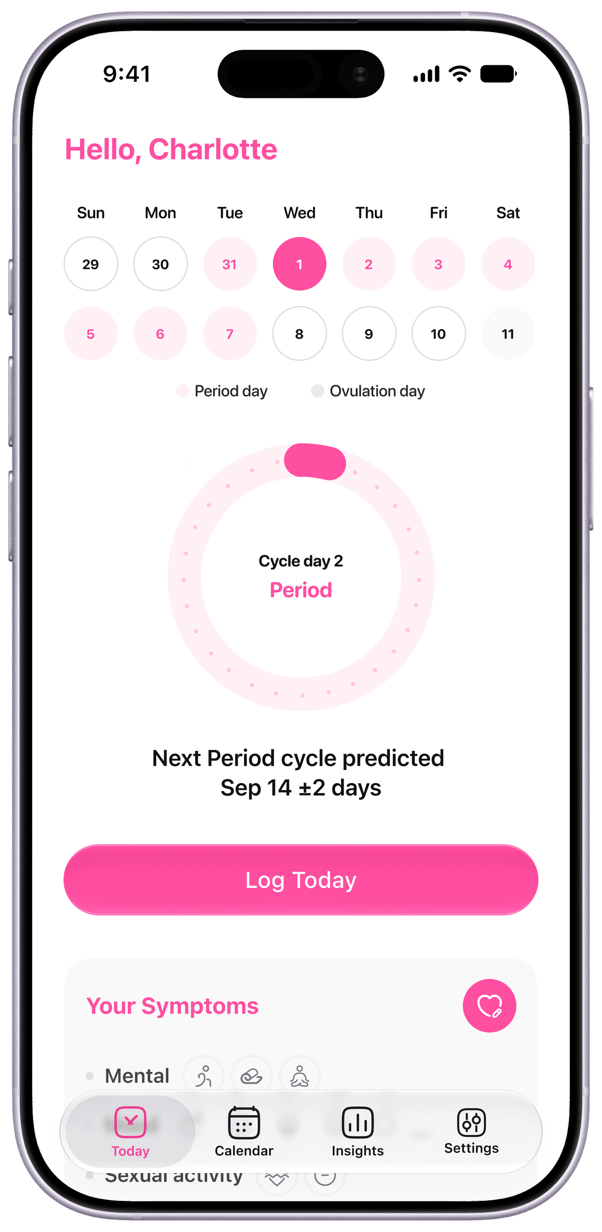
The Bayesian cycle predictor is the core of the app, and it's worth actually explaining rather than gesturing at "machine learning." The model is a Bayesian Gaussian Process, running entirely on-device via CoreML, on the Neural Engine. It maintains a posterior distribution over the user's next cycle length rather than a single guess, which is the whole point. Instead of predicting "your period starts on the 14th," it predicts a distribution, and shows the 80% confidence interval that distribution implies: a predicted date, plus a lower and upper bound, plus a confidence score from 0 to 1.
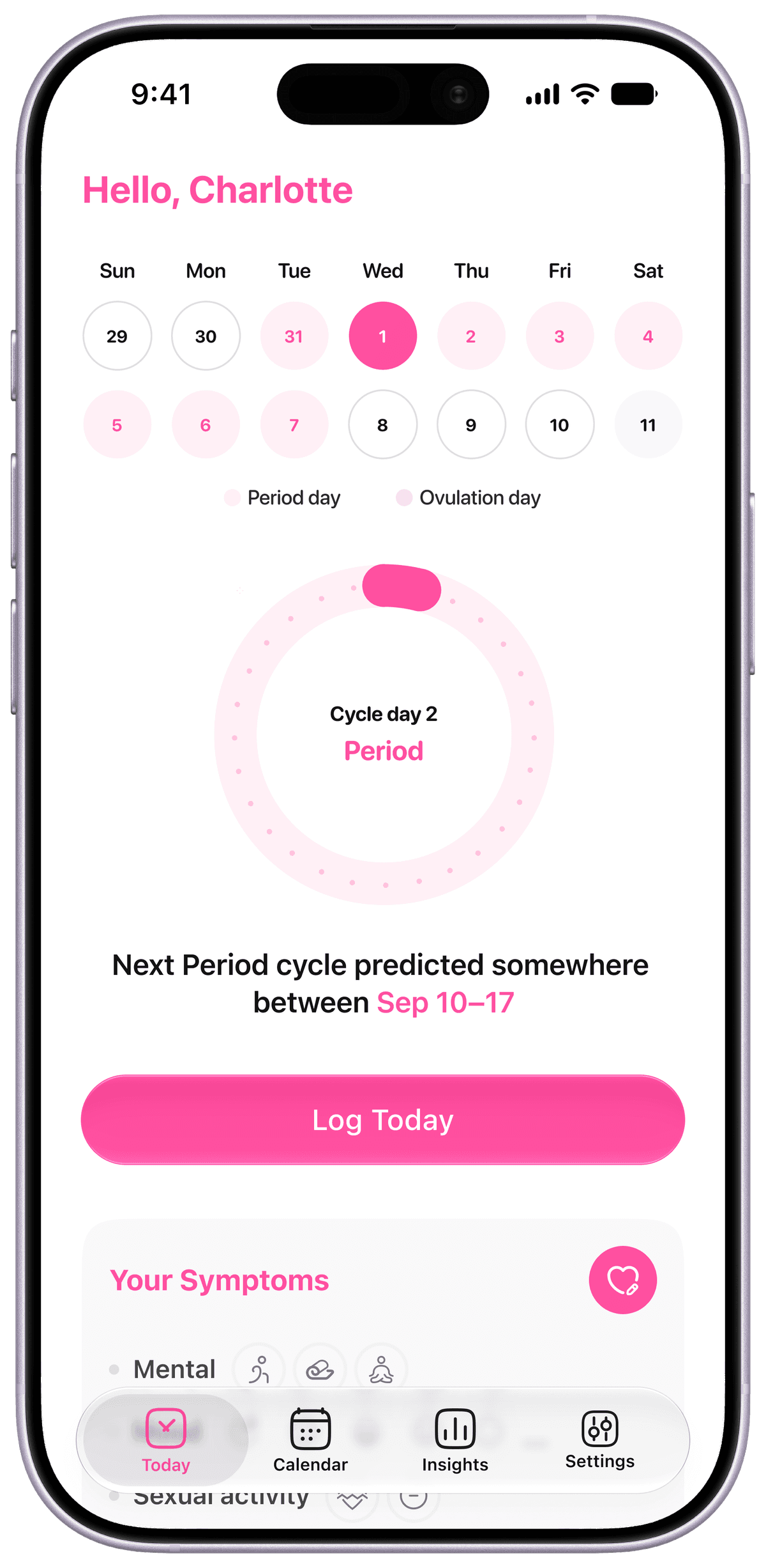
Cold start is the first hard problem. A new user has logged nothing. The model starts with a population-mean prior from the same three onboarding questions every user answers (last period start, typical cycle length, typical period duration) which is enough to produce a real, if wide, prediction on day one (roughly ±5–7 days). Every confirmed period after that triggers a Bayesian posterior update, and the interval narrows. The product doesn't pretend to know you on day one. It says so, visibly, and then it actually learns.
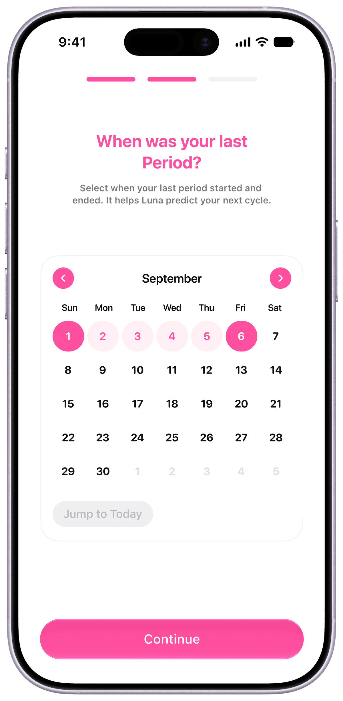
Luna is Free (for now). Nothing like 'Subscribe for premium' or 'Log more to unlock accuracy'
The model itself is small on purpose; under 200KB, under 5ms inference, because it needs to run inline, on-device, every time. There's no batching this against a server. It ships as a .mlpackage, trained offline in Python against synthetic data generated from population research distributions (never real user data, by design. The training pipeline lives in a separate repo specifically so that boundary can't blur), then fine tuned on-device via CreateML as the user logs.
Soon enough I encountered a problem. In the original PRD I defined irregular-cycle mode twice, and the two definitions disagree. The Core Features section and the Notification Rules table both say the trigger is cycle length variance exceeding 7 days over the last 3 cycles. The ML Stack section; stated twice, independently, says the trigger is standard deviation exceeding 5 days over the same window. Nobody had caught it, because on a skim they read like the same claim. They're not the same claim, and only one of them is real. Standard deviation is the number actually feeding the Bayesian model's posterior width. It's the statistic the model computes anyway, as part of doing its job. Variance-over-7 was never wired to anything; it was a number I wrote into a table that never got reconciled against the model spec.
I went with stddev > 5 days, logged it as a formal decision, and flagged the two sections in the original doc that needed correcting to match. Two reasons beyond "it's the real number":
It's a tighter threshold, which means irregular-mode users get identified sooner rather than later.
And given that irregular users are the whole beachhead this product is built around, sooner is the safer failure mode. Getting a PCOS user into honest range-based predictions a cycle earlier is a better mistake to make than the reverse.
I went with stddev > 5 days, logged it as a formal decision, and flagged the two sections in the original doc that needed correcting to match. Two reasons beyond "it's the real number":
It's a tighter threshold, which means irregular-mode users get identified sooner rather than later.
And given that irregular users are the whole beachhead this product is built around, sooner is the safer failure mode. Getting a PCOS user into honest range-based predictions a cycle earlier is a better mistake to make than the reverse.
Once that trigger was settled, the next decision was architectural rather than visual:
Irregular mode isn't a separate flow. It's a state that gets applied on top of onboarding, prediction, and notifications.
Concretely: Onboarding's third step shows a range instead of a fixed date if the flag is set. Prediction Detail shows the range plus a short "why a range" explainer instead of a single confident number. Notification copy switches to range language app-wide. None of these are new screens, they're the same components rendering a different state, which is both less work to build and, more importantly, means the irregular experience never feels like a downgraded or bolted-on version of the "real" app. It's the same app, being honest about what it currently knows.
Irregular mode isn't a separate flow. It's a state that gets applied on top of onboarding, prediction, and notifications.
Concretely: Onboarding's third step shows a range instead of a fixed date if the flag is set. Prediction Detail shows the range plus a short "why a range" explainer instead of a single confident number. Notification copy switches to range language app-wide. None of these are new screens, they're the same components rendering a different state, which is both less work to build and, more importantly, means the irregular experience never feels like a downgraded or bolted-on version of the "real" app. It's the same app, being honest about what it currently knows.
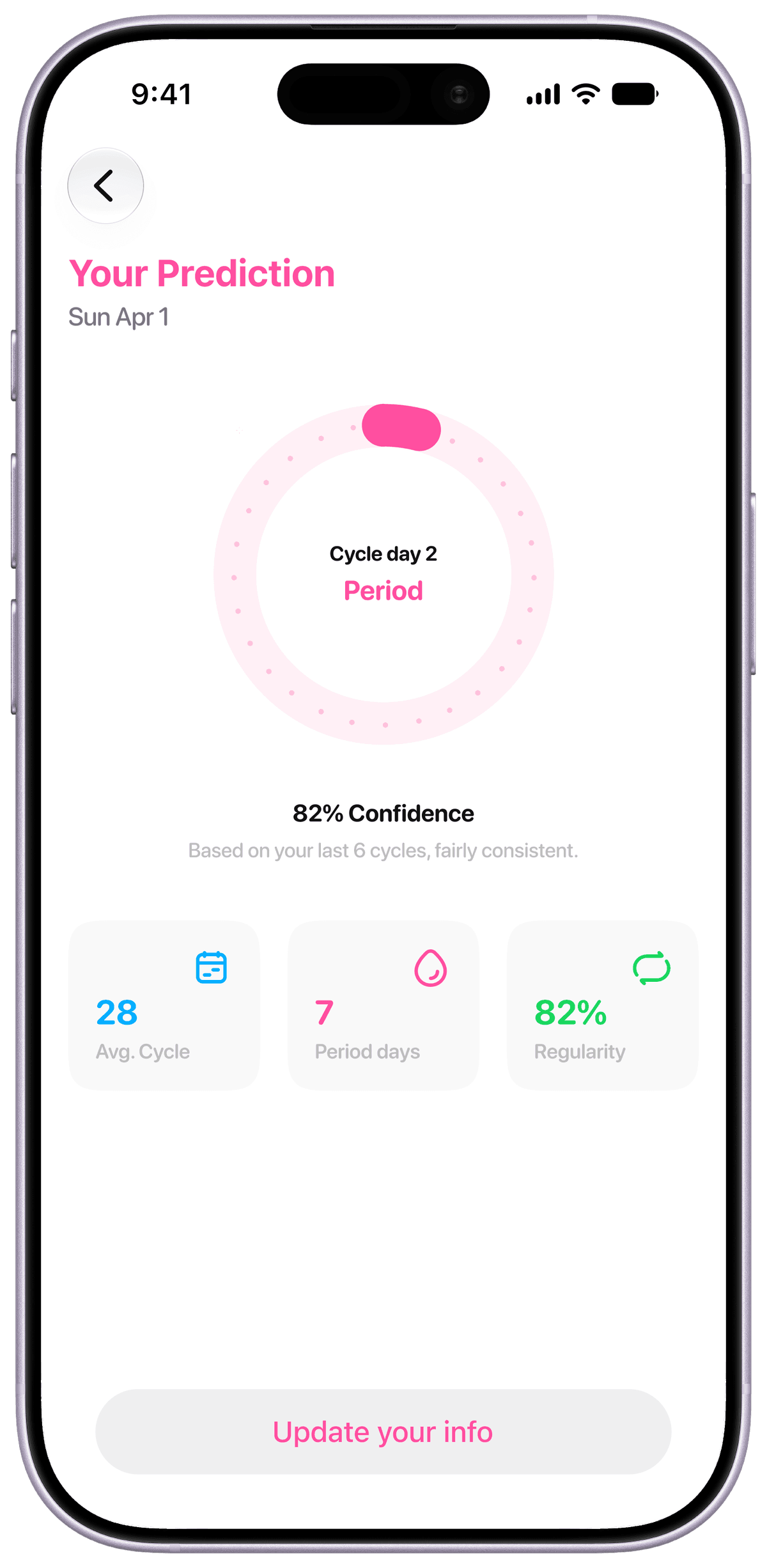
Regular and Irregular cycles.
Every notification has to pass one bar before it ships:
Does the user know, after reading it, why they should care right now?
If the answer isn't obviously yes, it doesn't go out. That single rule kills most of the lazy notification copy that period apps default to.
Does the user know, after reading it, why they should care right now?
If the answer isn't obviously yes, it doesn't go out. That single rule kills most of the lazy notification copy that period apps default to.
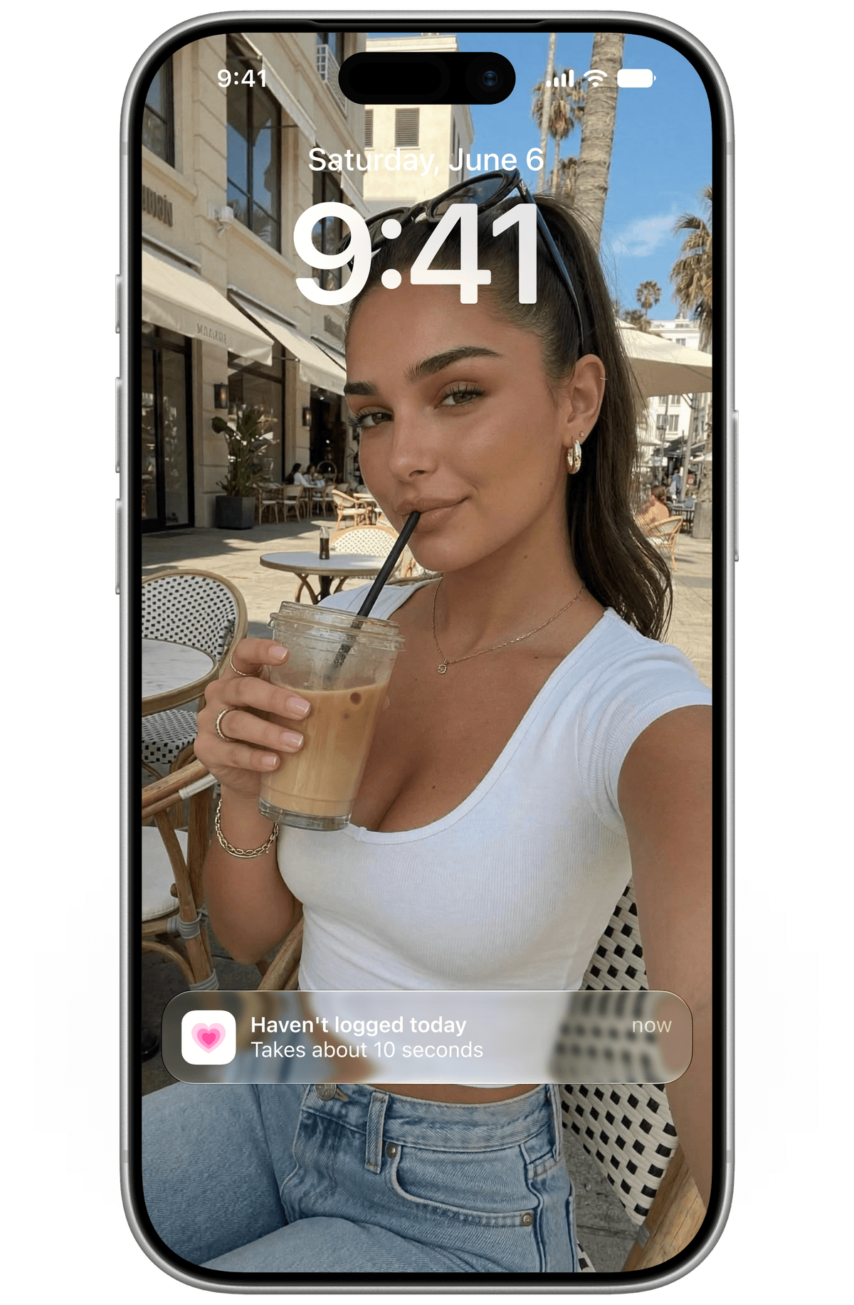
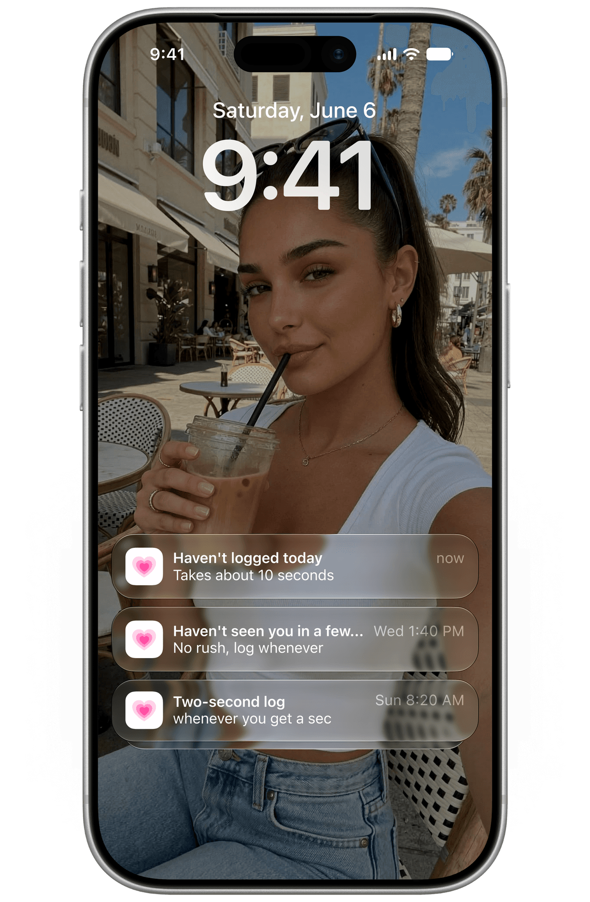
There are five notification types, each with its own trigger, and a rules engine that applies hard constraints none of them can override:
One notification per 24 hours (two max, only on a predicted period start day)
Quiet hours from 10pm–7am by default and user adjustable
Dismiss-learning: Three dismissals of the same type suppresses it for 14 days and prompts a preference review instead of continuing to nag
One notification per 24 hours (two max, only on a predicted period start day)
Quiet hours from 10pm–7am by default and user adjustable
Dismiss-learning: Three dismissals of the same type suppresses it for 14 days and prompts a preference review instead of continuing to nag
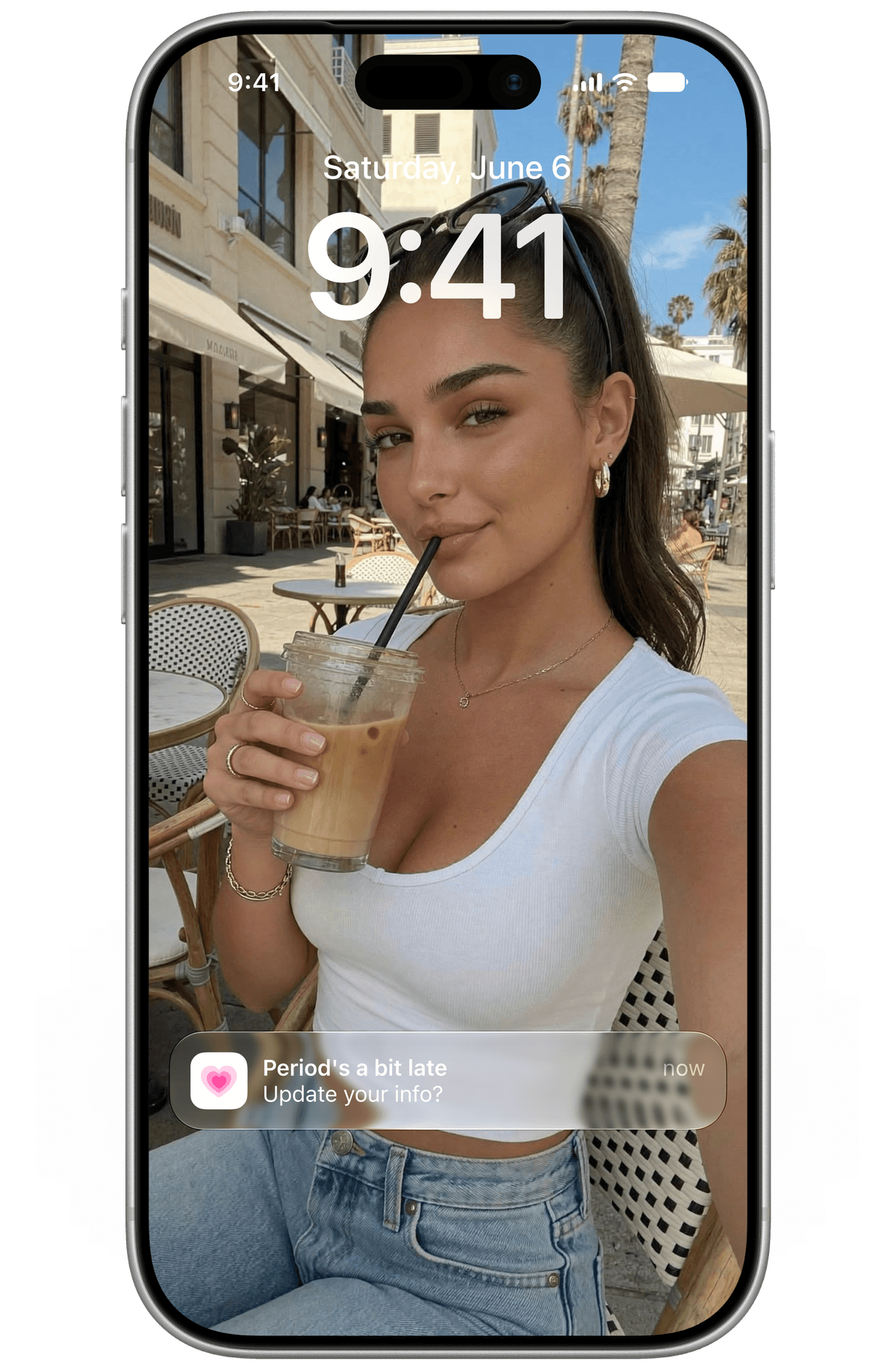
The one I actually had to design, rather than just implement, was the anomaly check-in (the notification that fires when a period is running later than expected) The original spec left this as "user-specific threshold" with no formula behind it. Inventing a new constant felt wrong when the model already outputs exactly the number needed: the check-in fires the first day past the active cycle's predictions.ci_upper, the upper bound the Bayesian model already computed. No new field, no new logic; and it's automatically softer for irregular-mode users, because their CI is already wider, so they get fewer false "you're late" moments than a regular-cycle user would at the same absolute day count. The personalization is a side effect of reusing the right number instead of a deliberate extra feature.
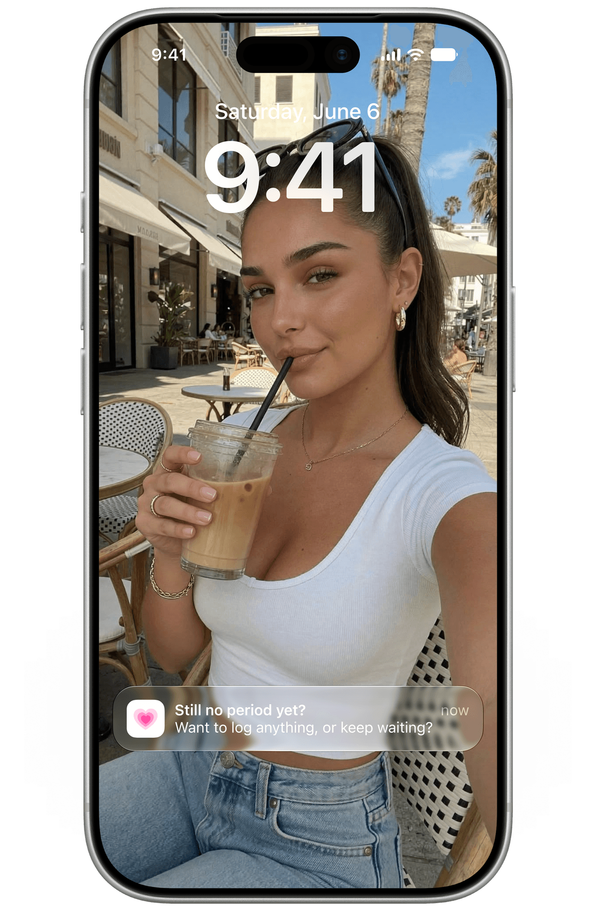
This sounds like your friend. 'You're 4 days late' is just off. Plus what if you aren't 4 days late?
The correlation notifications got a similar correction. The spec's Notification Rules table specified correlations should only fire at ≥78% confidence, but the model underneath (Pearson correlation with Bonferroni correction) doesn't natively produce a single confidence percentage. That number was never derived from anything. The real gate is what the Lifestyle Correlator actually tests for: p < 0.05, |r| > 0.4, Bonferroni-corrected, across at least 3 cycles. One gate, matching what the model actually computes, nothing invented.
The tone underneath all of this is the same principle applied to language instead of logic; Every string gets run through what is called the knowledgeable-friend test:
Would a friend who happened to be a doctor actually say this to you over coffee?
"Your period is 4 days late" becomes something closer to "Your cycle's running a bit longer than usual. That happens." No jargon, no clinical framing, no manufactured urgency. Even the send timing is personalized:
Would a friend who happened to be a doctor actually say this to you over coffee?
"Your period is 4 days late" becomes something closer to "Your cycle's running a bit longer than usual. That happens." No jargon, no clinical framing, no manufactured urgency. Even the send timing is personalized:
An on-device contextual bandit (epsilon-greedy, ε = 0.1) learns each user's best notification window from their own open/dismiss behavior, 90% exploiting what it already knows and 10% still exploring for a better time.

While brainstorming, I browsed lots of screens from other period trackers to use as structural reference for flow mapping (entry points, branching, how screens chain together). I noticed some of these apps has a Community tab, an AI chat assistant that can take lab result uploads and suggest "consult a doctor," and a content library of articles and videos, which almost made me rethink and rewrite the PRD, but I discussed it with my friends and I was able to conclude (big s/o to them) . Luna is a wellness tracker, not a diagnostic tool. So it’s safe to say it’s one of a kind? But either way I used the screens for shape (how a flow branches, how a settings hub nests things) and explicitly did not use them for scope, and wrote that distinction down rather than letting it stay implicit. That's a smaller moment than the Bayesian model or the notification engine, but it's the one I'd point to if someone asked what "product thinking" actually looks like day to day. Most of good product design is having something you could add, that would look complete, and choosing not to.
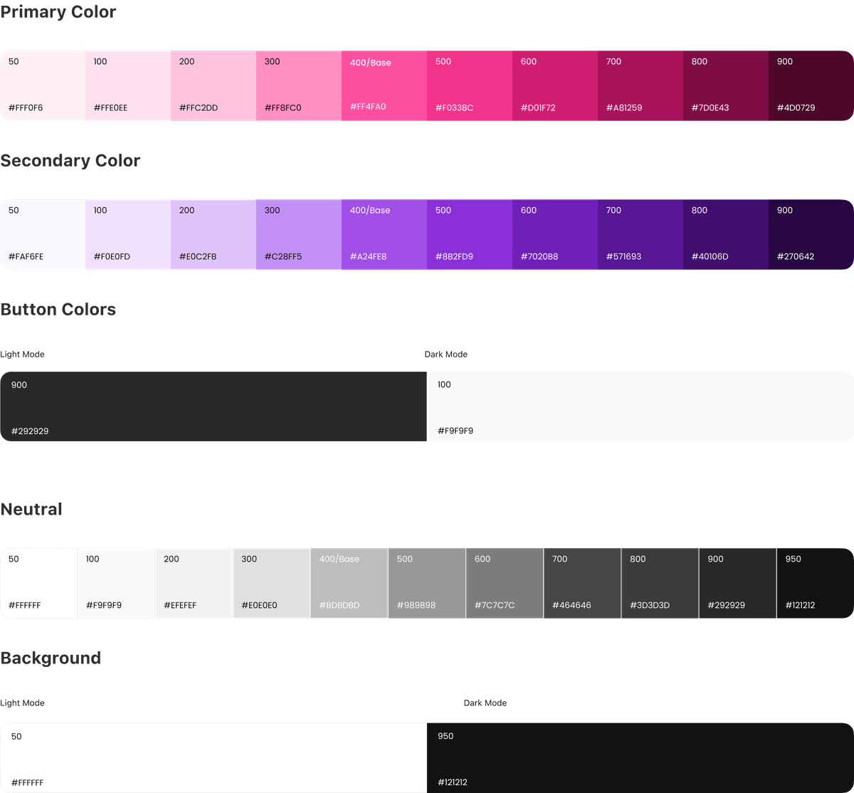
The identity is built around two full palette families. Pink and Lilac. Each with a proper 50–900 shade range, mapped to light and dark mode through semantic tokens. Iconography is fully custom, and deliberately steers clear of the visual shorthand most health apps default to. No hearts, no pills, no medical crosses. Dark mode isn't a pass done at the end; every screen gets built and checked in both modes from the start. The nested-heart mark grew out of the same palette work, and gives the brand an actual anchor to point to.
The mascot is the part of this I've enjoyed most as a craft problem. She has locked, specific details on purpose. Warm brown wavy hair, a lavender scrunchie, a blush pink knit sweater, freckles as the signature detail that has to survive every variant (Generated from a single neutral base pose that then gets reused as a reference image for every emotional variant, rather than regenerating her from scratch each time and hoping she stays recognizable). Consistency through reference turned out to matter more than any single prompt.

The architecture is local-first: SQLCipher-encrypted SQLite, with the encryption key derived from the device's Secure Enclave and never leaving the hardware boundary. Sync is opt-in, and when it's on, the server is zero-knowledge (Every record arrives already encrypted, keyed only to a device fingerprint hash, so there's nothing on the server side that can actually be read. No email, no phone number, no login, anywhere in the app).
That last part sounds like a security decision, but it's the reason there's no signup screen, no login screen, no forgot password flow, no OTP anywhere in onboarding. Most apps have those screens by default and have to justify cutting them. Luna never had them to begin with, because the architecture doesn't support an identity for them to authenticate.
That last part sounds like a security decision, but it's the reason there's no signup screen, no login screen, no forgot password flow, no OTP anywhere in onboarding. Most apps have those screens by default and have to justify cutting them. Luna never had them to begin with, because the architecture doesn't support an identity for them to authenticate.
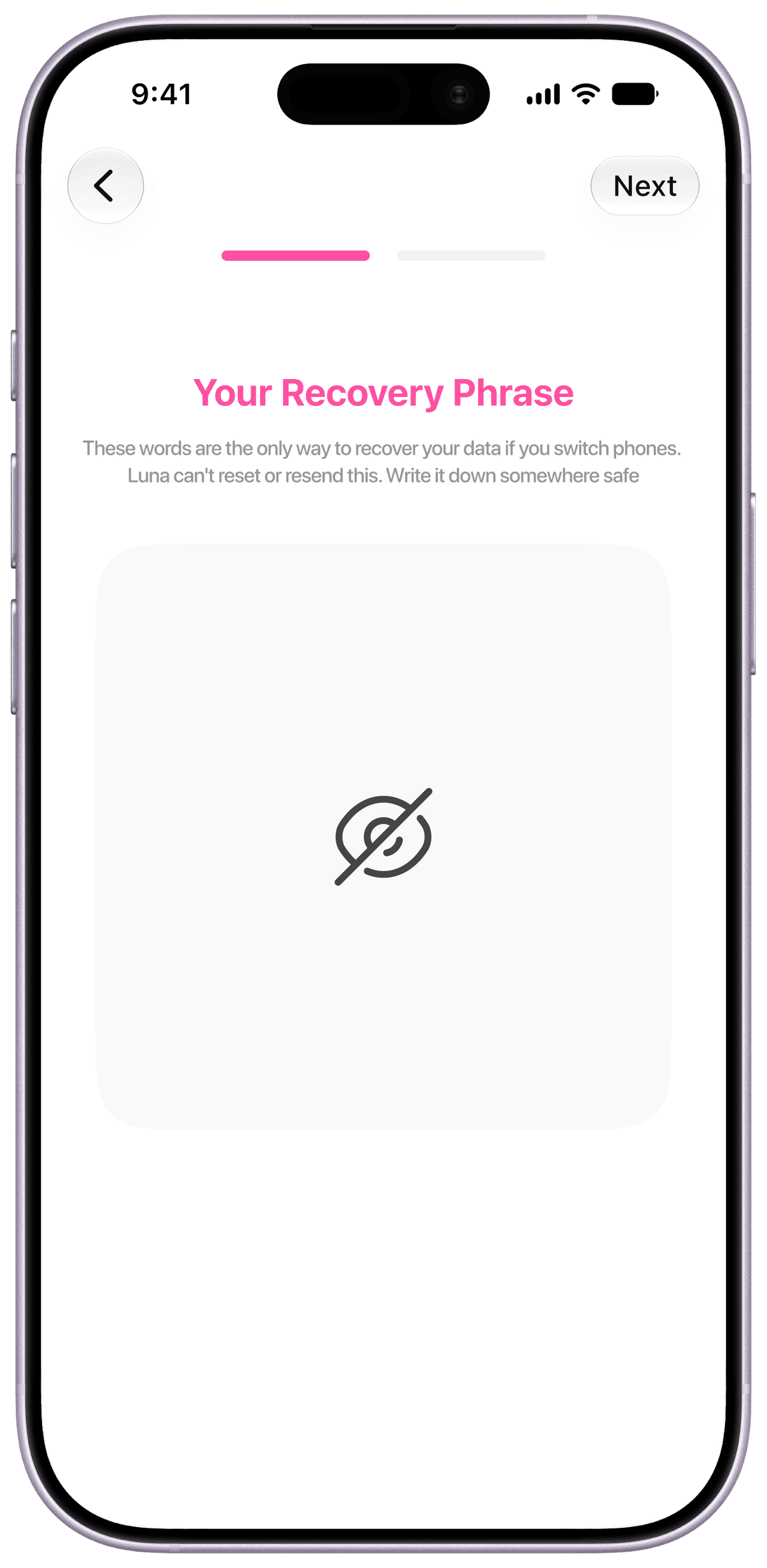
The recovery phrase (a 24 word BIP39 mnemonic) is the one piece of that architecture with a real UX cost, and it's deliberately not handed to every user at first launch. Generating one during onboarding would add a screen against a hard <60-second "time to first prediction" target, and it would be meaningless for anyone who never turns sync on (it would just be a recovery phrase protecting data that was never uploaded anywhere). It also front loads a high stakes "do not lose this" moment before the user has any reason yet to trust the app with something that serious. So it's generated exactly once, exactly when sync gets turned on, in Settings. Not before.
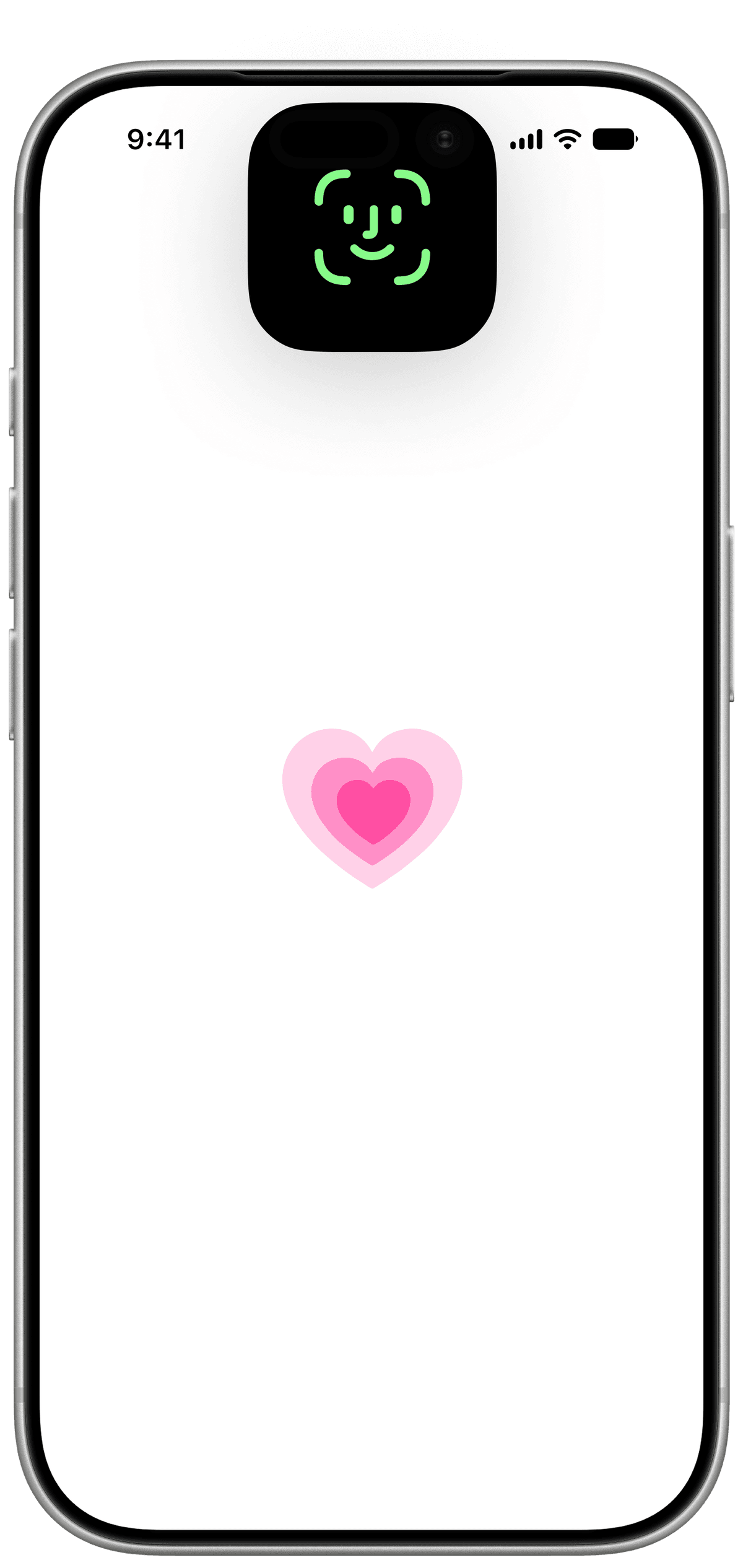
App Lock followed a similar two layer split. There's an invisible layer (the local database encryption itself, always on, not a toggle, not a screen, just how the app works from first launch) And there's a visible layer (Face ID with passcode fallback) required to open the app, on by default because privacy is the actual product here, but toggleable in Settings for anyone who finds a biometric check unnecessary friction on an app they might open ten times a day for a ten second log. Treating those as two separate decisions, rather than one "security" checkbox, is what let the visible layer stay optional without weakening the invisible one at all.
App Lock followed a similar two layer split. There's an invisible layer (the local database encryption itself, always on, not a toggle, not a screen, just how the app works from first launch) And there's a visible layer (Face ID with passcode fallback) required to open the app, on by default because privacy is the actual product here, but toggleable in Settings for anyone who finds a biometric check unnecessary friction on an app they might open ten times a day for a ten second log. Treating those as two separate decisions, rather than one "security" checkbox, is what let the visible layer stay optional without weakening the invisible one at all.
One thing worth naming explicitly is that every decision in this piece (the stddev correction, the anomaly trigger, the correlation gate, the recovery phrase timing, the two-layer lock) lives in an actual running decisions log, versioned and numbered, that sits alongside the flow map and the original PRD. A project with a Bayesian model, a rules engine, an encryption architecture, and an onboarding target all in tension needs a single place where "why did we choose this" doesn't live only in someone's memory.
Luna is in active development.
I really enjoy talking about Luna. You can probably tell :)