Back to home
OOM v2
Game UI/UX Designer
March, 2026
OOM (Oya One More) started as a real, physical tabletop game before it was ever an app. The founder digitized it, shipped it to the Play Store & App Store, and let it run long enough to collect actual player reviews. When they came back for a v2, they didn't come with a moodboard or a vague "make it better" they came with a document built entirely from what players had already told them, changes they felt was necessary too, and asked me to design against it. First time I'd ever done UI/UX for a game. Let’s dive in
You can't design a game you don't understand and understanding is something that actually mattered most, before a single frame got designed.
A physical game has rules that live in people's hands; pacing, turn order, the specific feeling of a roll going your way, all of it worked out already, over however many real sessions, before it ever needed a UI. Digitizing that isn't a visual problem first. It's a translation problem. Get the translation wrong and you can ship a beautiful screen that plays nothing like the game people already love.
So we spent an enormous amount of time on calls (at different hours), more than once, the founder walking me through the game from scratch each time a new system came up. At one point they called me while they were physically playing it, so I could hear the game happen in real time instead of having it described secondhand.
That's not a normal part of a design engagement, and it's exactly the reason the v2 systems actually hold together
A physical game has rules that live in people's hands; pacing, turn order, the specific feeling of a roll going your way, all of it worked out already, over however many real sessions, before it ever needed a UI. Digitizing that isn't a visual problem first. It's a translation problem. Get the translation wrong and you can ship a beautiful screen that plays nothing like the game people already love.
So we spent an enormous amount of time on calls (at different hours), more than once, the founder walking me through the game from scratch each time a new system came up. At one point they called me while they were physically playing it, so I could hear the game happen in real time instead of having it described secondhand.
That's not a normal part of a design engagement, and it's exactly the reason the v2 systems actually hold together
The brief I was handed wasn't a feature wishlist invented in a strategy meeting. It was distilled from real reviews collected after MVP1 had been live. That matters the same way it mattered on Zill: every system in the doc traces back to an actual behavior or complaint from real players, not a guess about what might be fun. The job wasn't ‘come up with ideas for a game’ it was ‘read what people who already play this are telling you, and design the answer’.
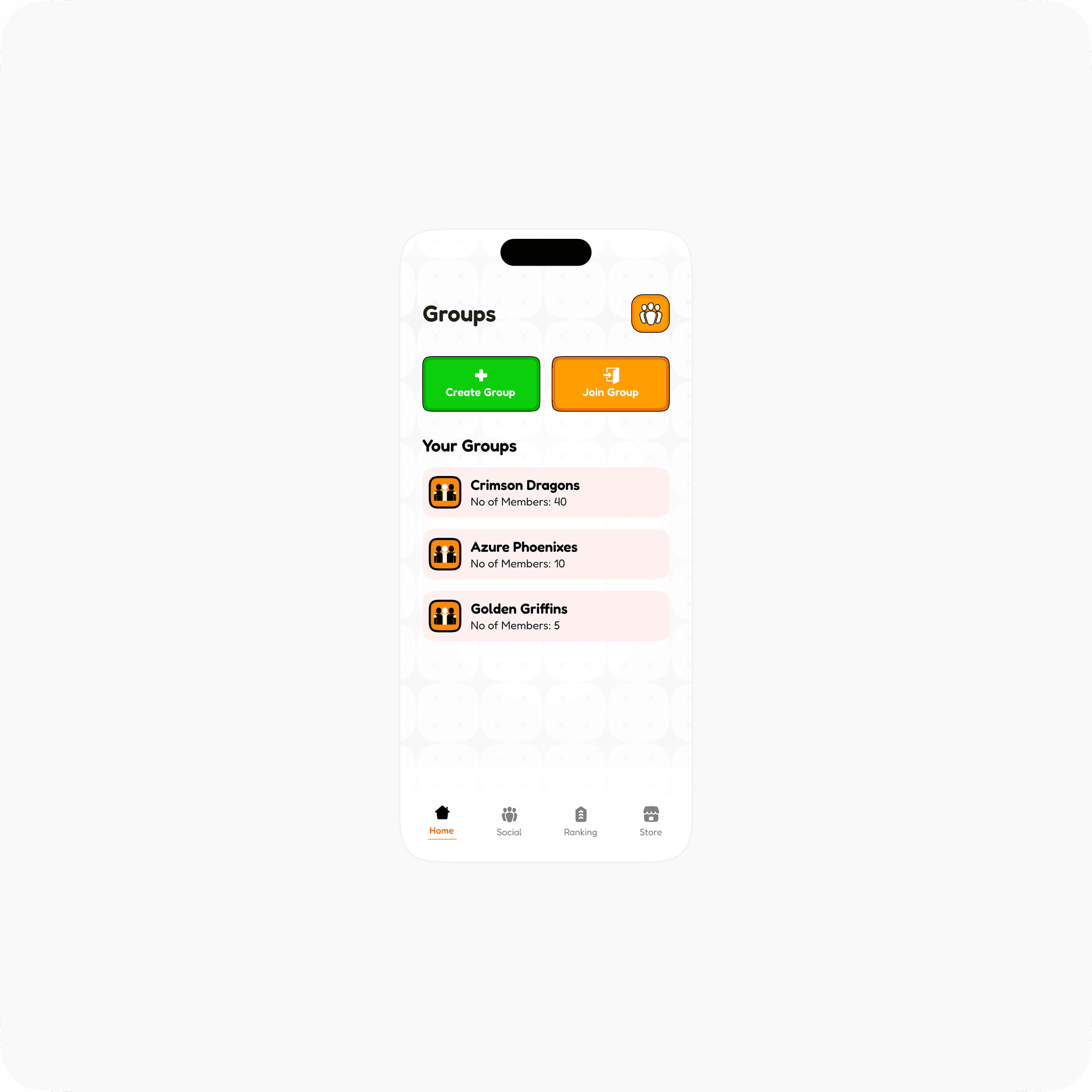
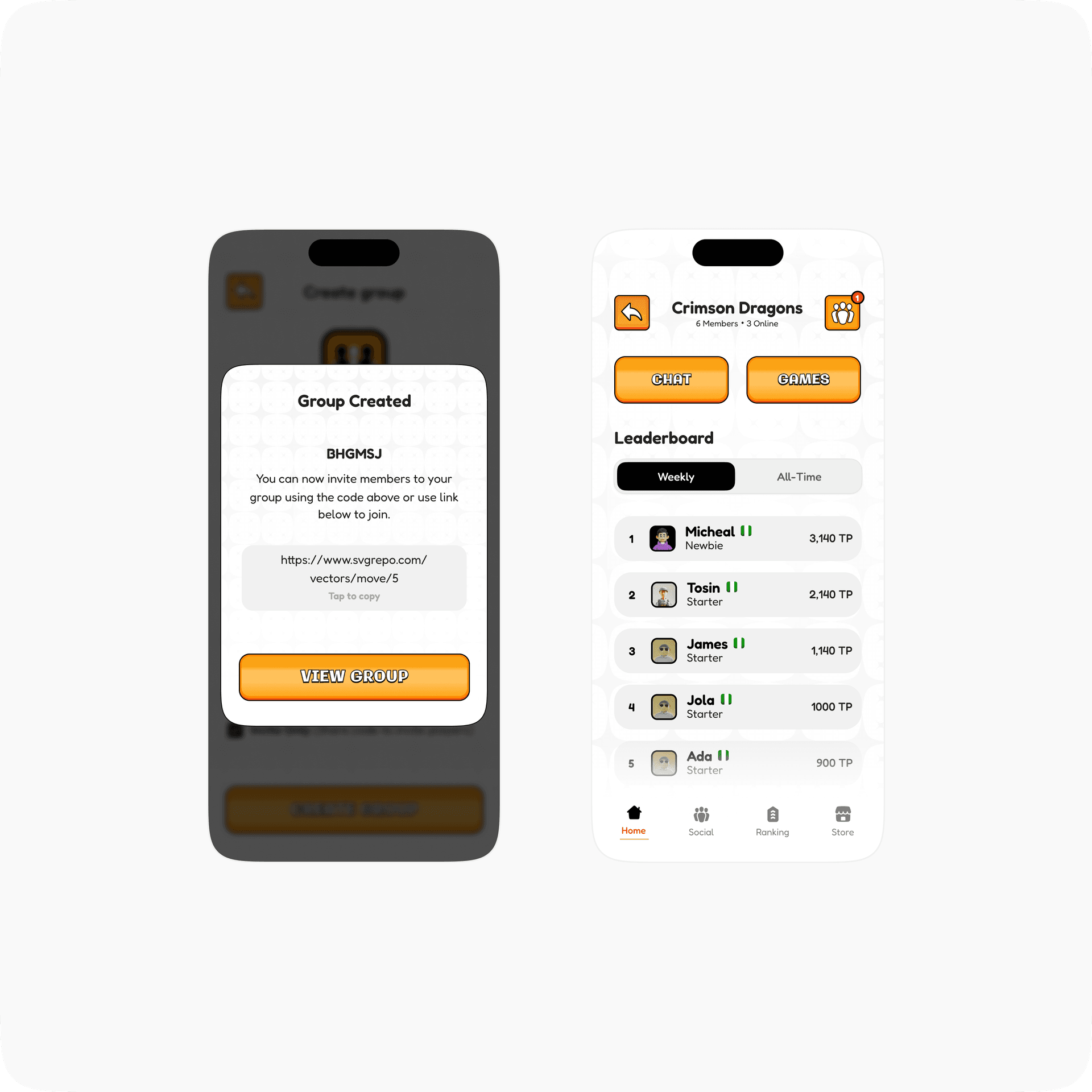
MVP1's Groups was built around one-off, single session competition. You play, it ends, that's the whole arc. V2 reframes that entirely: a Social Group System where players contribute turns or points over time instead of settling everything in one sitting, backed by a lightweight text chat room, friend adding by username, and weekly/all-time leaderboards. The design shift underneath that is bigger than it sounds. The UI now has to represent ongoing group standing, not just a single match result screen. A group has to feel alive to check in on, the way a running group chat does, rather than something you only open mid game.
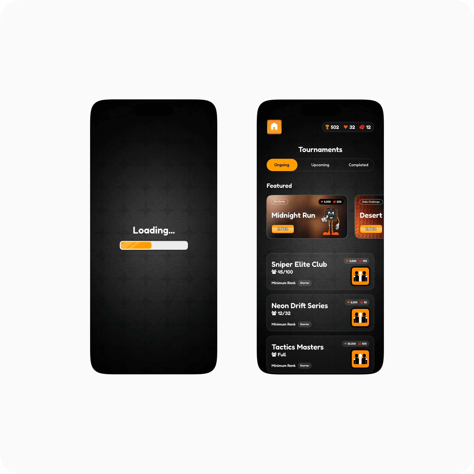
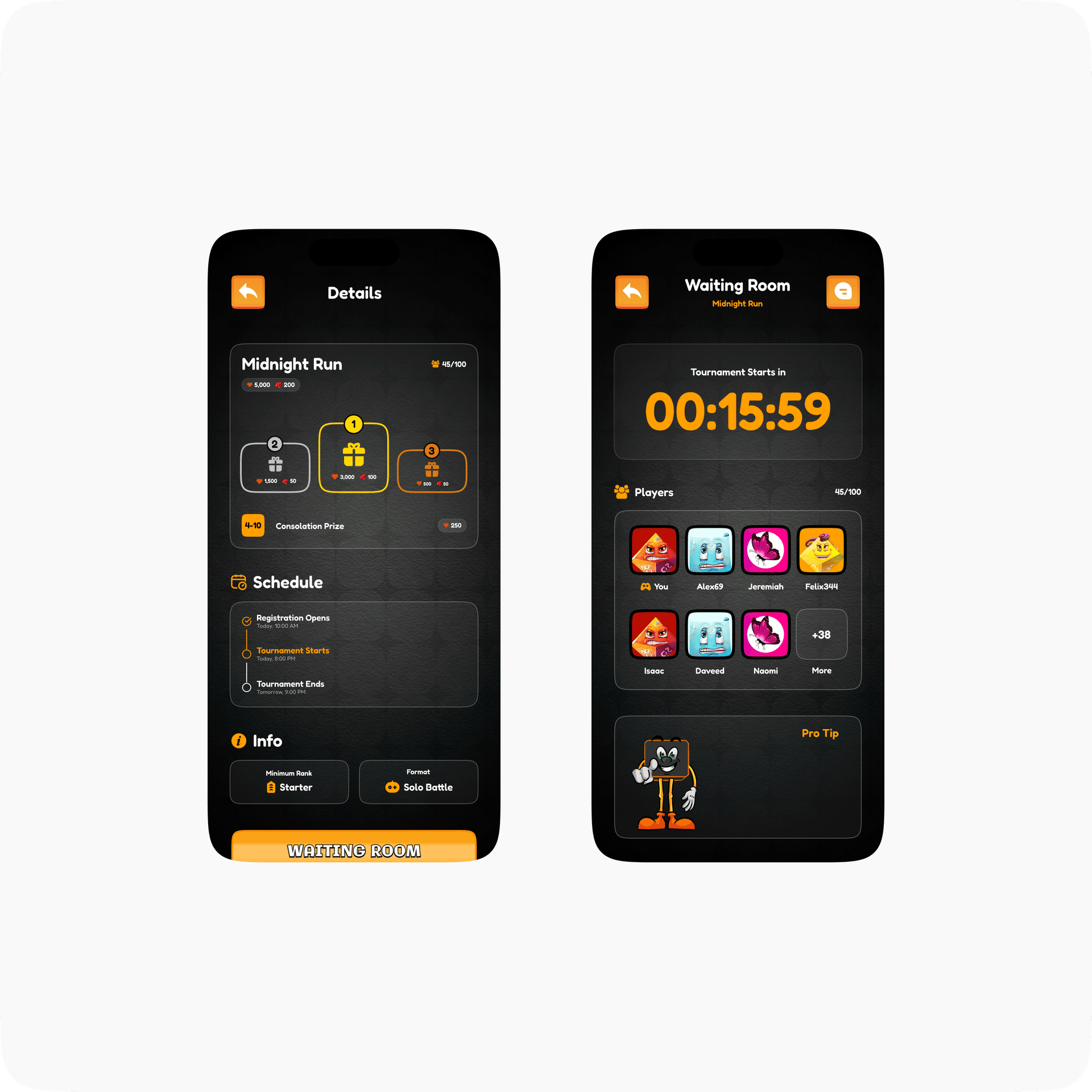
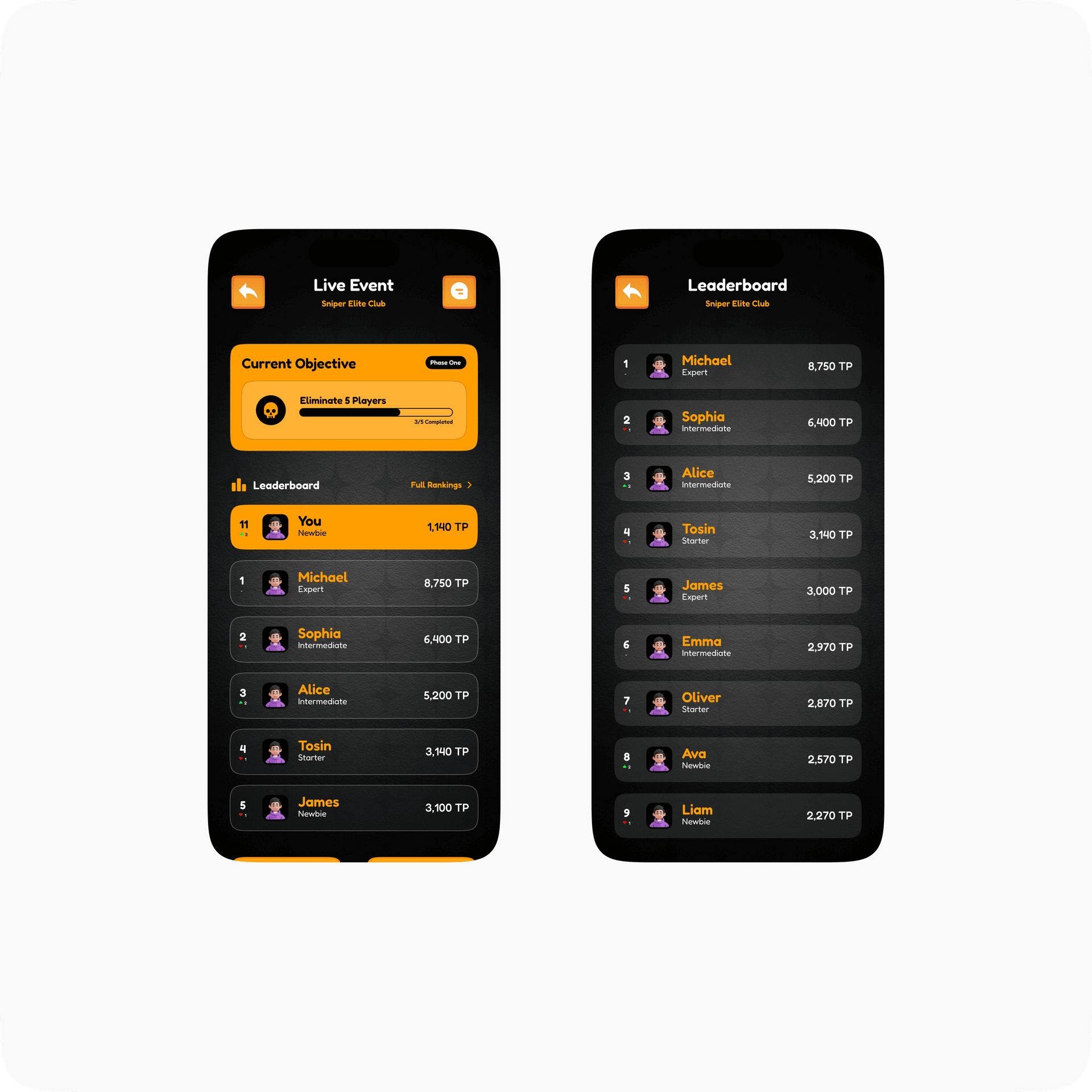
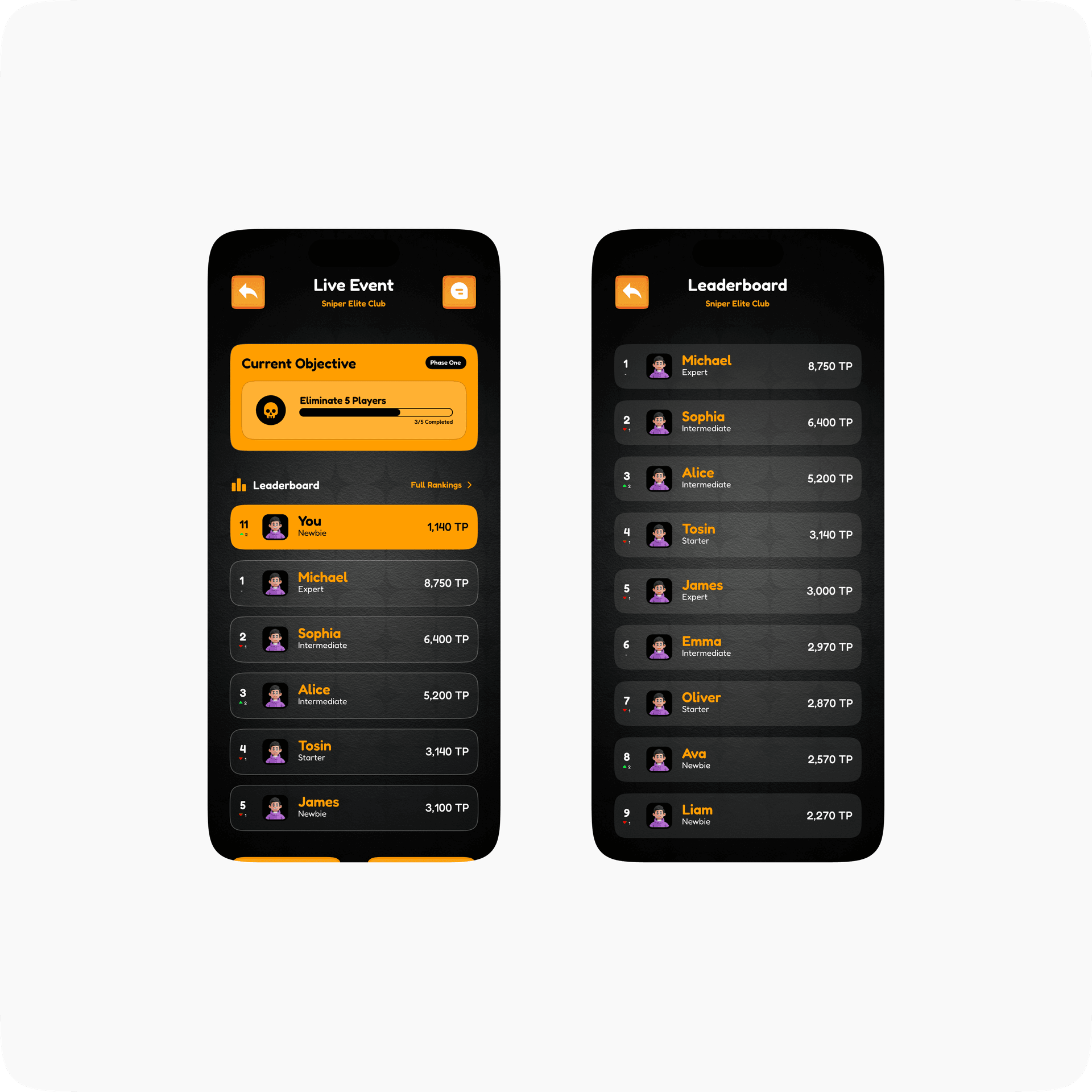
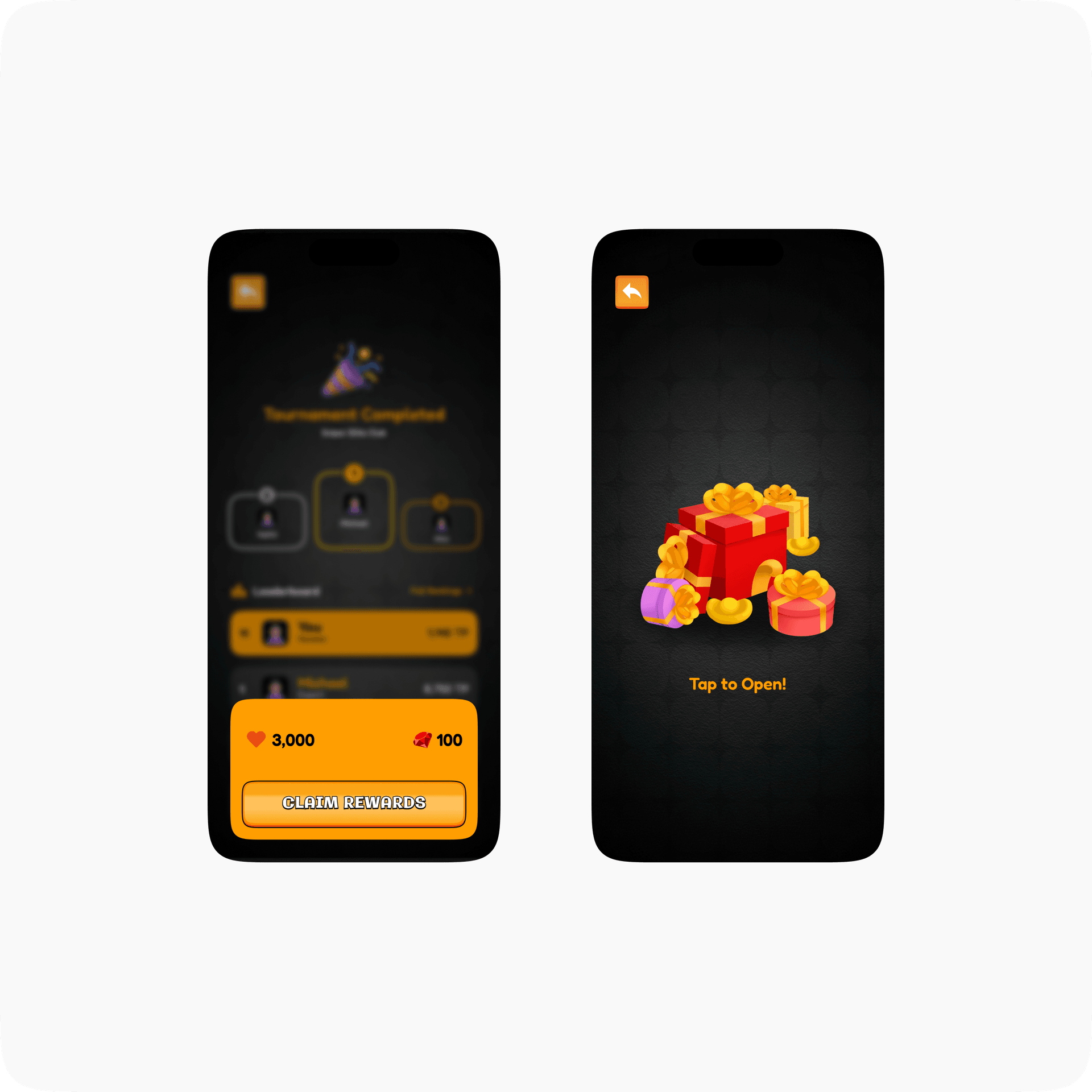
Tournaments are events and/or campaigns. With a specific duration, max turns, scoring type, it’s own leaderboard, set up manually.
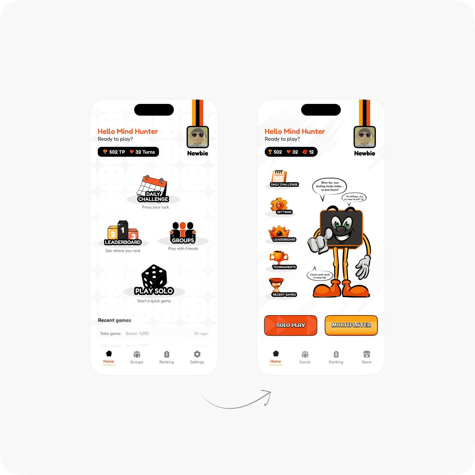
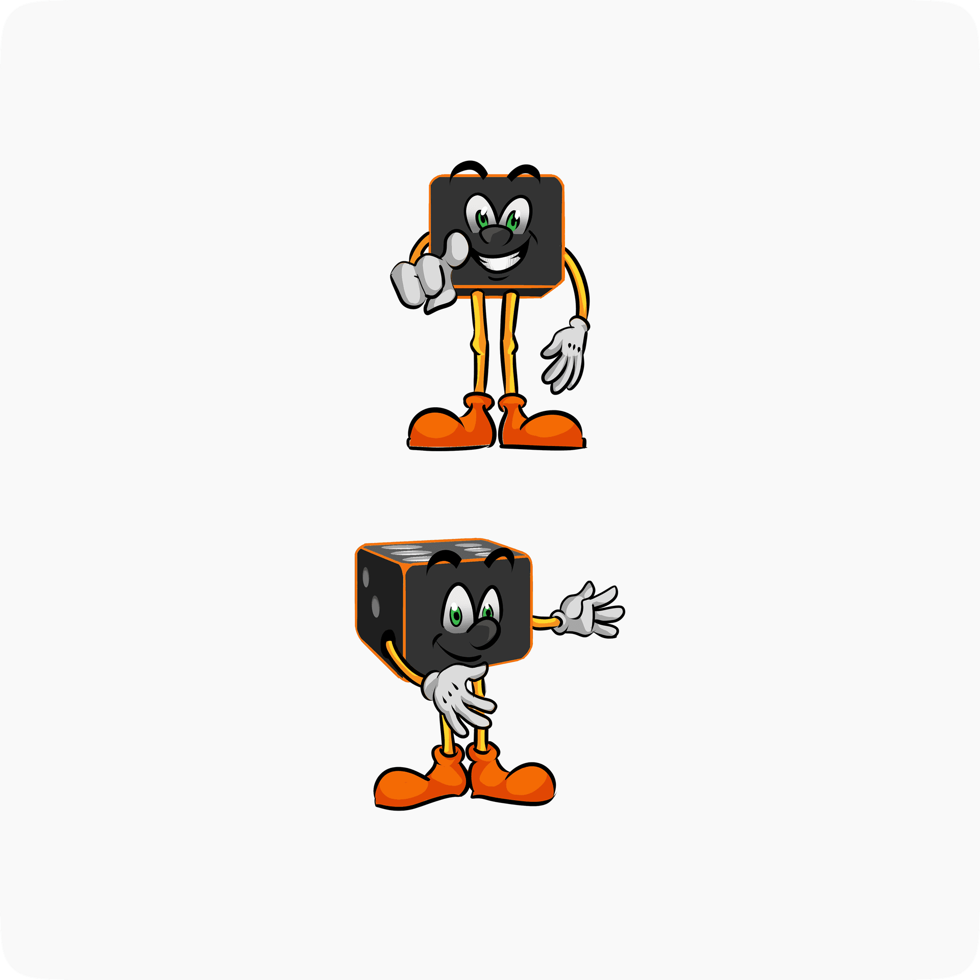
The v2 brief introduced a mascot; visual presence through gameplay, menus, and achievement moments, with short reusable audio cues for wins, bursts, and unlocks, no full voice system yet. Designing a mascot for a game that already has an established, loved physical identity is a specific kind of constraint: Ginger has to feel like they belong to the game people already play at a table.
In MVP1, turns were purely a gameplay resource (something you spend to play). V2 turns that into a soft currency: turns can now buy unlockable profile pictures and a fixed length ad-free period, and custom profile picture uploads get deliberately gated behind either being disabled or requiring a turn spend.
That's a meaningful reframe for the UI. The game now needs a place that reads as a shop, not just a wallet balance sitting in a corner, and needs to make spending turns feel like progression rather than a paywall.
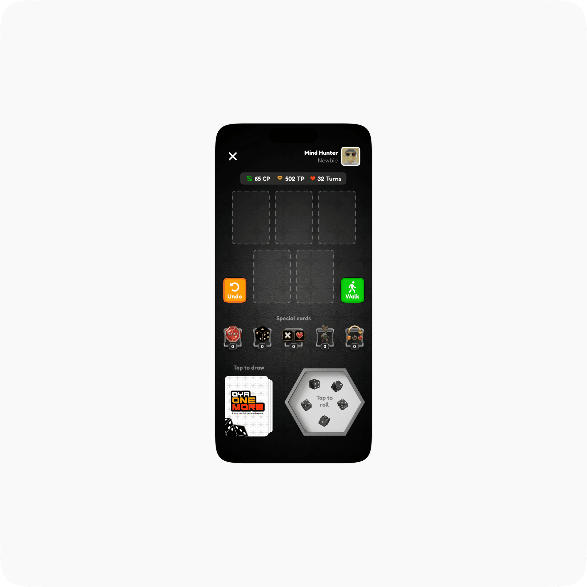
Power-up cards extend the same economy further
That's a meaningful reframe for the UI. The game now needs a place that reads as a shop, not just a wallet balance sitting in a corner, and needs to make spending turns feel like progression rather than a paywall.
Power-up cards extend the same economy further
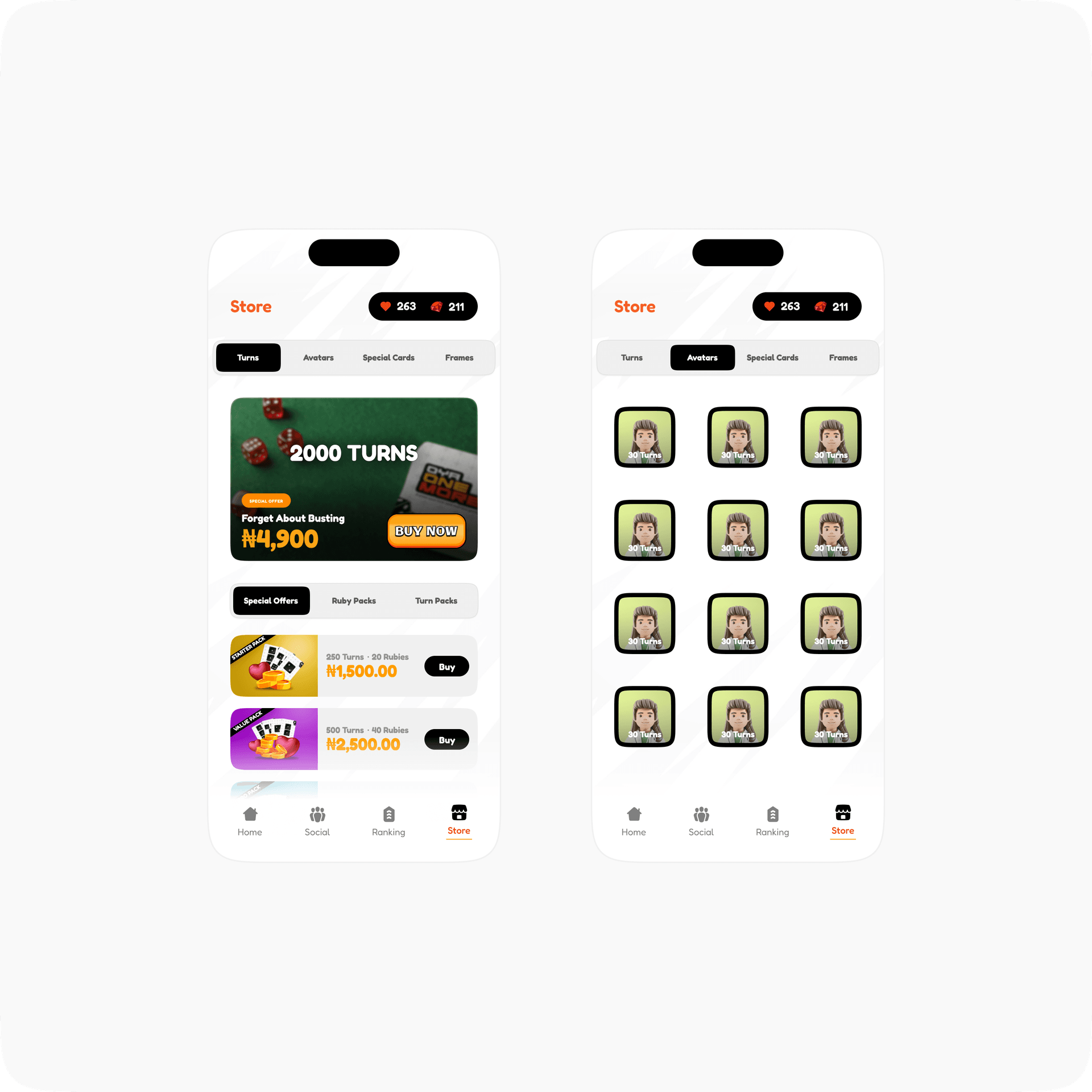
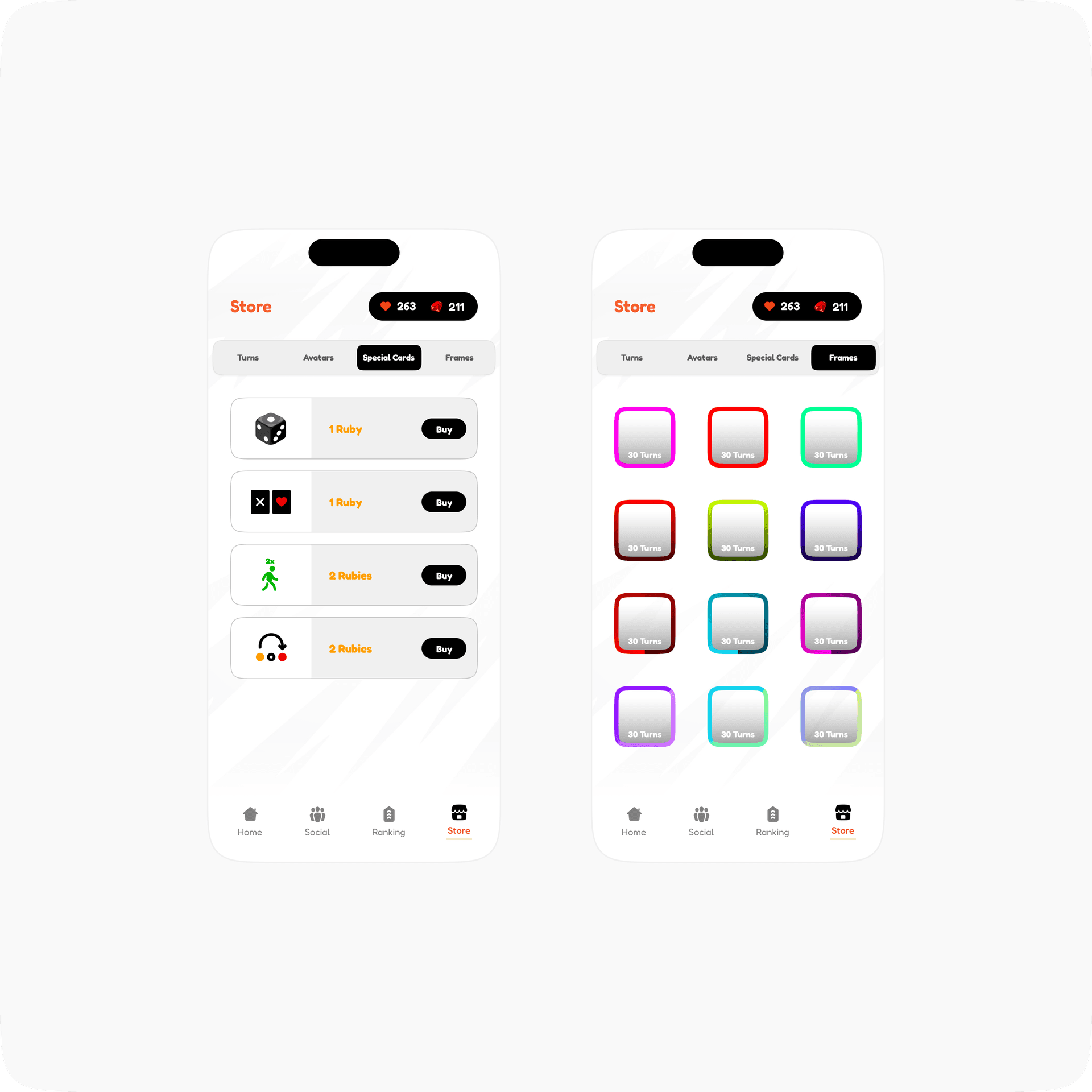
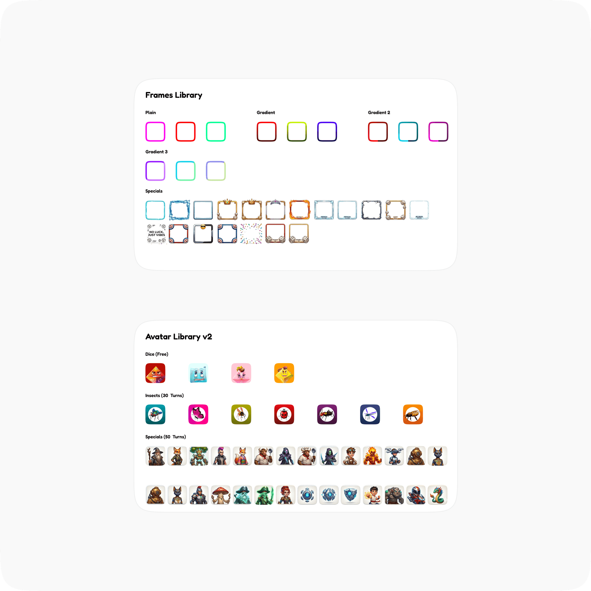
This is the piece of V2 that was fully mine to build out from nothing: A complete avatar library and a matching frame library, both tied directly into the turns economy and the progression system above. Profile customization stops being a one time setup step and becomes something players keep coming back to unlock, which also does real work in the group and leaderboard views, since a wider avatar/frame set means players are visually distinguishable from each other at a glance instead of blending into a list of names.
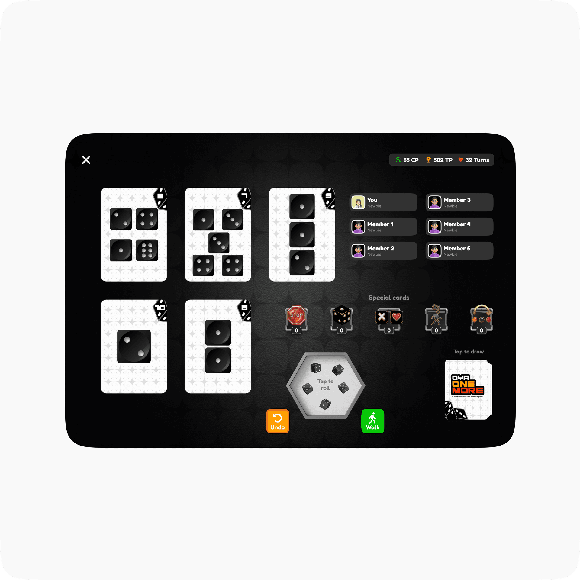
Alongside the phone experience, I designed a full tablet version of the game.
This was my first game UI/UX project, and the honest reason it worked is the team, not just the brief. Billions of calls, a genuine willingness to explain the same mechanic three different ways until it landed, and a founder who called me mid-game just so I could hear it happen live. That's a level of access most design engagements never get, and it shows in how tightly the v2 systems actually match how the game is supposed to feel. Big shoutout to them. Genuinely one of the most fun projects I've worked on.