Back to home
Zill
Lead UI/UX Designer & Lead Frontend Dev
May, 2026
Zill is campus e-commerce infrastructure; A marketplace where students buy, sell, negotiate prices, and leave campus with an actual financial history instead of just a graduation photo.
The thing that makes this project different is that none of it is guesswork. Every decision below traces back to a number.
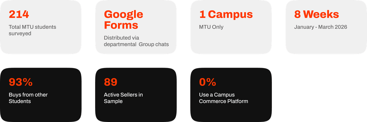
Before any of this hit Figma, we ran a structured survey across Mountain Top University. 214 respondents, verified current students, distributed through departmental WhatsApp groups over eight weeks. 89 identified as active sellers, 125 as buyers only, spread fairly evenly across all four years. That split matters: it meant we could ask sellers questions buyers can't answer (how much do you actually earn, do you keep records?) and ask everyone the questions that shape the core product (do you trust this? would you use it?).

I'm leading with this because it's easy to design a marketplace app that looks considered. It's a different thing to point at a specific number and say "this is why the verification badge is more prominent than the price."
93% of MTU students have bought something from a fellow student. Not "would consider". Have, already, 79% of them more than once. Campus peer-to-peer commerce isn't a gap we're creating demand for. It's the default way students on this campus already acquire goods. The question was never "will students do this?" it was "will they do it here instead of where they already are?"
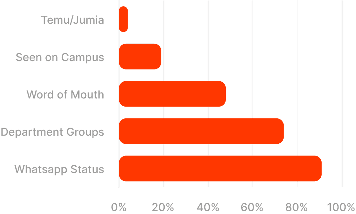
Where they already are is WhatsApp. 91% discover listings through someone's WhatsApp status, 74% through departmental group chats. 0% percent use anything purpose built. Every single listing on campus, structurally, disappears in 24 hours and is unsearchable while it's live.
73% of students said they don't know if a seller is trustworthy. 44% have personally been cheated (sent the wrong item, an inferior one, or nothing at all). And when we asked what the single most important thing a campus marketplace has to get right, 43% said knowing the seller is a verified, more than double the next answer. Built-in negotiation, the feature I personally assumed would rank near the top, got 8%.
That one stung a little, honestly, it reordered what "core" meant. Negotiation is a nice to have layered on top of a marketplace people already trust. Verification is the marketplace. Everything about how identity and trust surface in the UI. The ‘verification badge’, the ‘Verified student’ framing, comes directly from this finding, not from a moodboard.
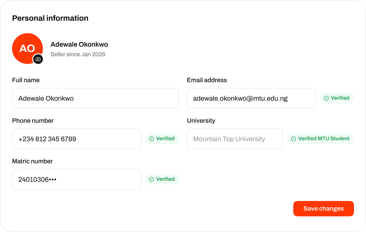
Verified seller badge/profile card in the live UI
Sellers have no financial history, and it already worries them. This is the finding that gave the project its long-term thesis, not just its MVP. 85% of active sellers keep no structured record of what they sell. 64% keep literally nothing. And separately, 69% of sellers told us they've already, unprompted, worried about having no proof of income by the time they graduate. That's not a problem we'd be inventing a solution for. It's an anxiety that already exists and currently has nowhere to go.
That's what the seller dashboard and the planned Business Credibility Score are actually for Not "analytics as a nice extra," but building the first verified, exportable financial history this specific population has ever had. 47% of sellers already earn ₦20,000+ a month doing this. These aren't hobby sales. They're small, real, unrecorded businesses.
The same question that ranked verification at 43% put "clean, modern design, looks like a proper app" at 19%, ahead of built-in negotiation. In the open-text follow-ups, students said things like "it needs to look like something we'd actually share." That's a direct, research backed argument for treating visual polish as core product work rather than something to trim under deadline pressure, which is the argument I actually use when defending time spent on interaction details that don't show up in a feature list.
86% of sellers want a dedicated store link. something like yourname.zill.store That they can drop into an Instagram bio or WhatsApp status. The dominant reason, again and again in the open text; it looks more serious. A free storefront that a student is proud to share is also free distribution for Zill. Every link posted is an ad we didn't pay for. That's the whole reasoning behind prioritizing Zill Stores as the flagship differentiator rather than a late stage add on.
The MVP isn't everything. It's the smallest thing that proves the loop. A student can sign up, find their campus, and buy or sell something. Five phases, sequenced deliberately:
Phase 1 (Onboarding): Sign up, log in, find-campus (three states: search pills, results, empty), campus voting (if your university is not on Zill yet), a success screen, Supabase Auth wired in, route protection middleware. This is the front door. It has to be flawless before anything else is worth building, because a broken first 60 seconds means nobody sees the rest of the research above pay off.
Phase 2 (Marketplace): The homepage feed, listing cards, category filters, a flash-deals row, the product detail page, and the offer flow.
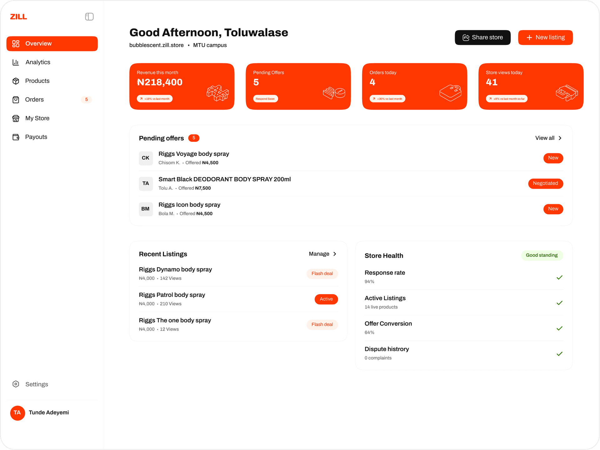
Phase 3 (Seller Tools): Create listing, image upload, an offer inbox with accept/decline/counter, a basic analytics dashboard, and a seller-verification gate.
Phase 4 (Individual storefronts): storename.zill.store routing, public store fronts, store-level analytics. This is the 86%-of-sellers-want-this feature.
Phase 5 (Analytics & Bank Partnership): The full business-intelligence layer the 85%-no-records and 69%-graduation-anxiety findings point toward, designed, eventually, to power real loan applications at graduation.
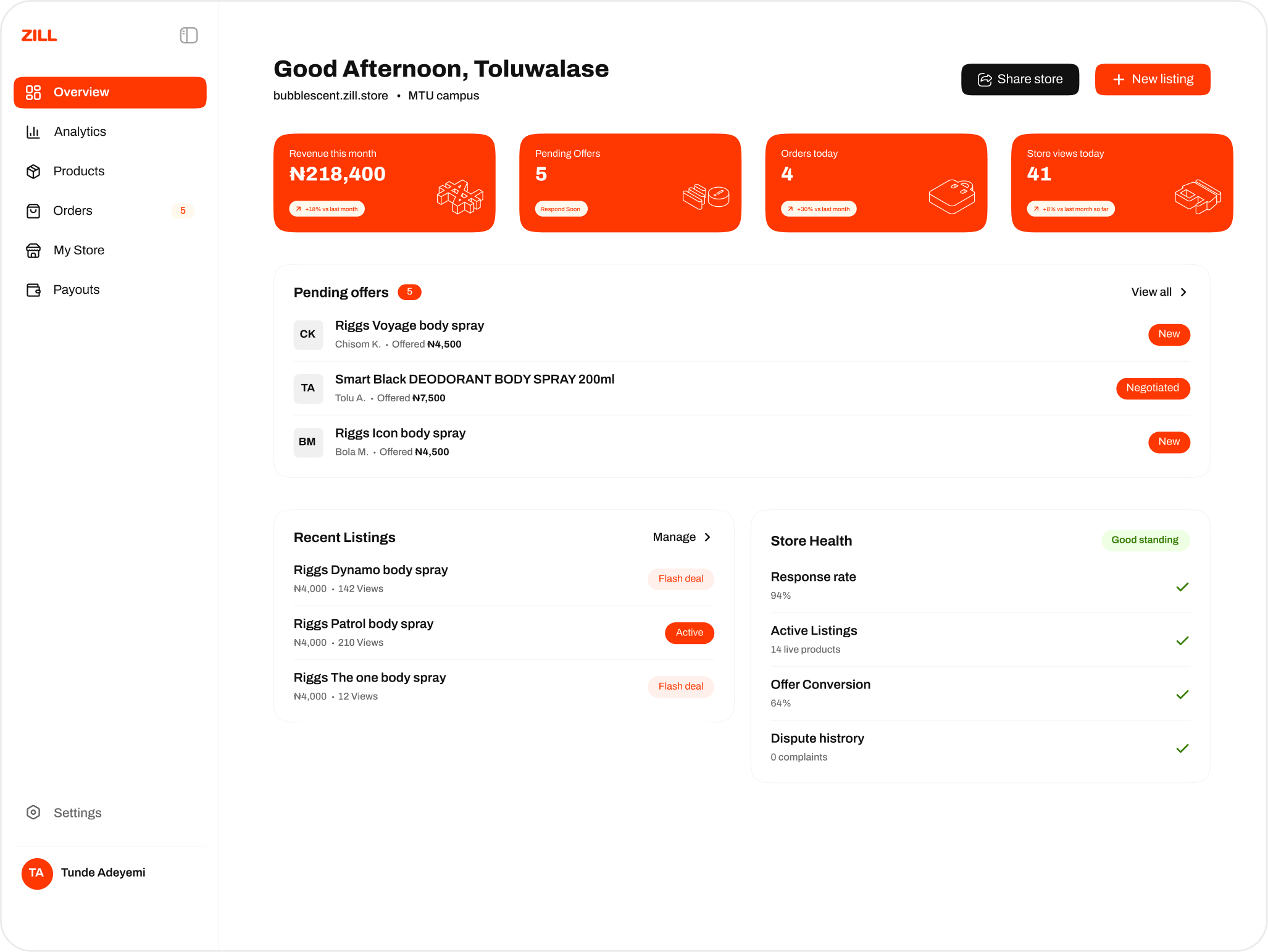
I own Phase 1's screens end to end and lead design across every phase; the dashboard (Phase 3) is fully designed and currently being built.
Phase 1 (Onboarding): Sign up, log in, find-campus (three states: search pills, results, empty), campus voting (if your university is not on Zill yet), a success screen, Supabase Auth wired in, route protection middleware. This is the front door. It has to be flawless before anything else is worth building, because a broken first 60 seconds means nobody sees the rest of the research above pay off.
Phase 2 (Marketplace): The homepage feed, listing cards, category filters, a flash-deals row, the product detail page, and the offer flow.
Phase 3 (Seller Tools): Create listing, image upload, an offer inbox with accept/decline/counter, a basic analytics dashboard, and a seller-verification gate.
Phase 4 (Individual storefronts): storename.zill.store routing, public store fronts, store-level analytics. This is the 86%-of-sellers-want-this feature.
Phase 5 (Analytics & Bank Partnership): The full business-intelligence layer the 85%-no-records and 69%-graduation-anxiety findings point toward, designed, eventually, to power real loan applications at graduation.
I own Phase 1's screens end to end and lead design across every phase; the dashboard (Phase 3) is fully designed and currently being built.
The plan for every seller's storefront was yourname.zill.store. Clean, memorable, on-brand. Except zill.store is already owned by an unrelated Shopify store. Something we found out after the subdomain scheme was already baked into copy, mockups, and a pitch deck. Subdomains under a root you don't own don't work, obviously, so the whole storefront model needed a different root domain. zill.ng is where we've landed.
The offer flow:
An offer is a row in an offers table: listing_id, buyer_id, offered_price, counter_price, and a status enum that only ever holds one of four values; Pending, Accepted, Declined, Countered. A buyer's initial offer hits POST /api/offers/create. Every response from the seller (accept, decline, or counter) goes through a single endpoint, PUT /api/offers/[id]/respond, which is the kind of small API decision that keeps state changes from drifting into three different code paths that can disagree with each other.
An offer is a row in an offers table: listing_id, buyer_id, offered_price, counter_price, and a status enum that only ever holds one of four values; Pending, Accepted, Declined, Countered. A buyer's initial offer hits POST /api/offers/create. Every response from the seller (accept, decline, or counter) goes through a single endpoint, PUT /api/offers/[id]/respond, which is the kind of small API decision that keeps state changes from drifting into three different code paths that can disagree with each other.
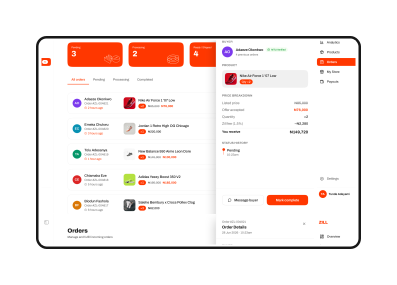
Designing the front end of that state machine meant making sure both buyer and seller always know, at a glance, which of the four states they're currently in.
The verification promise is structural. Profiles carries a matric_number field alongside campus_id and is_seller, which means "verified student" is a database fact. Auth runs through Supabase Auth (email/password plus Google OAuth, session management via @supabase/ssr), so identity is handled by infrastructure built for it. Given that verification was the single strongest survey finding (43% naming it the most important thing, 73% naming trust as their top concern) this is the one place in the stack where I'd argue the backend decision and the UX decision are actually the same decision.
Git discipline was also deliberate decision. Main is protected and only moves via PR, dev is where everything integrates first, and feature work lives in scoped branches like feat/onboarding or fix/button-colors. Commits follow a plain convention:
feat:, fix:, style:, chore:, docs:
Roles are split cleanly across the team: I own all Figma design and the frontend implementation that comes out of it; a separate frontend engineer owns routing, state management, and API route logic; a backend/data owner handles schema, RLS policies, and storage; product/strategy owns prioritization and the research above. The rule the team actually holds to is that nobody works on someone else's segment without a handoff. It's a small detail, but it's the difference between a project that reads as "I built this alone" and one that reads as "I know how to own my lane inside a real team".
feat:, fix:, style:, chore:, docs:
Roles are split cleanly across the team: I own all Figma design and the frontend implementation that comes out of it; a separate frontend engineer owns routing, state management, and API route logic; a backend/data owner handles schema, RLS policies, and storage; product/strategy owns prioritization and the research above. The rule the team actually holds to is that nobody works on someone else's segment without a handoff. It's a small detail, but it's the difference between a project that reads as "I built this alone" and one that reads as "I know how to own my lane inside a real team".
The landing page is live and collecting signups ahead of launch at MTU. Onboarding is in progress. The seller dashboard is fully designed and currently being built. Zill Stores and the full analytics/bank-partnership layer are the next horizon, sequenced deliberately behind the core loop rather than built first because they'd look impressive in a demo.
Big shoutout to the Zill team. (Can’t share too much cause we’re still cooking)